


You're no doubt familiar with London's iconic Underground map, and the names for Underground lines like Victoria, Circle, Bakerloo and Jubilee. But now the Overground trains in the network are being given new names reflecting the history and culture of the city.
In fact, they're being given names for the first time -- up until now, the complex overground network was just marked on the Tube map as the Overground, and all in one colour, orange.
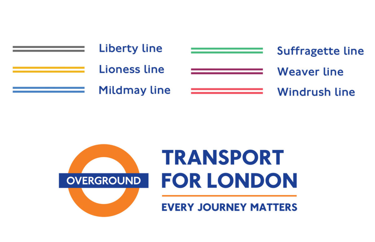
From this autumn, the six lines will have individual colours and names chosen with the communities they run through.
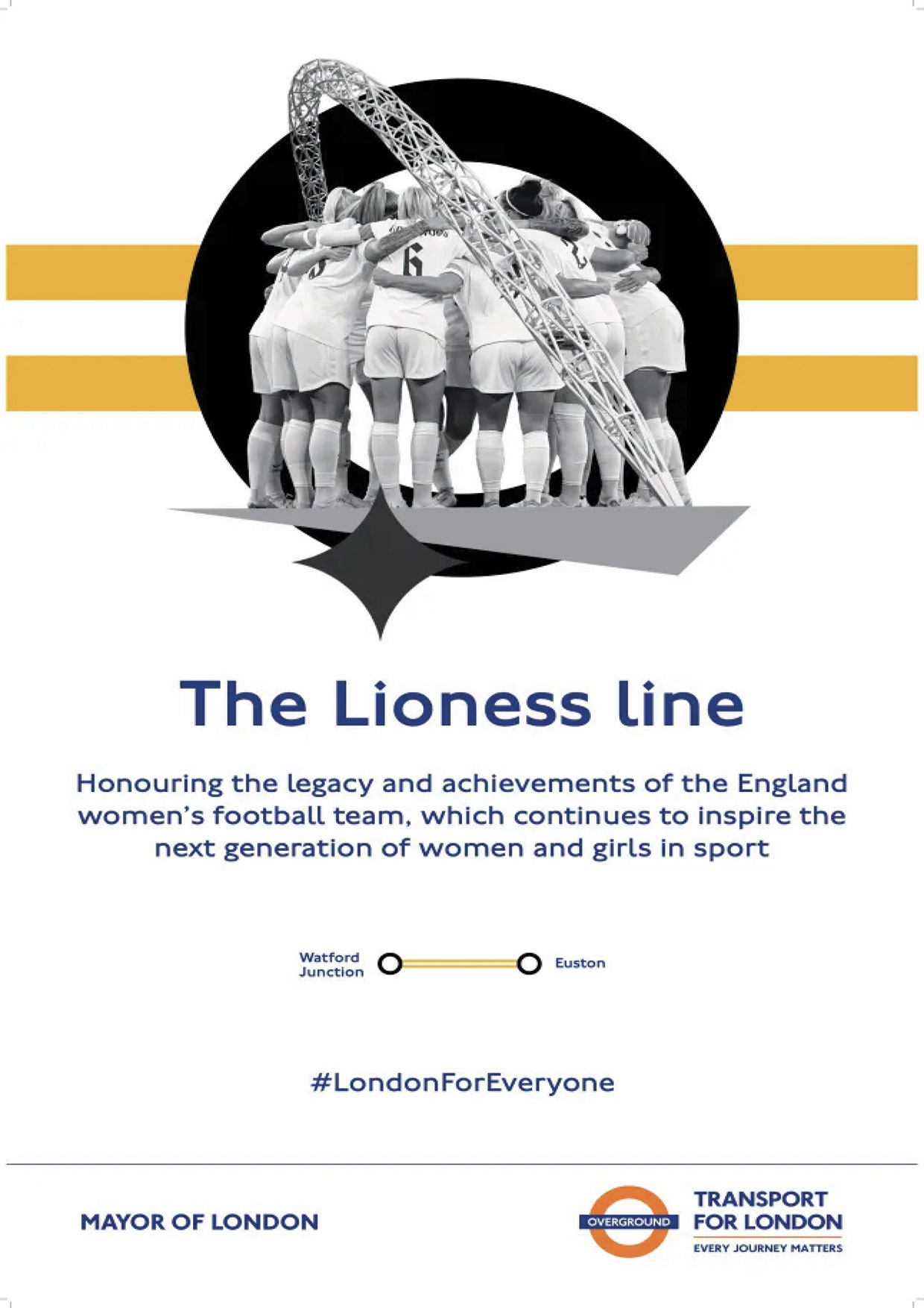
The Lioness line (yellow): runs under Wembley stadium, so the name honours the England women's football team, which won the UEFA Women’s EURO Cup there in 2022.
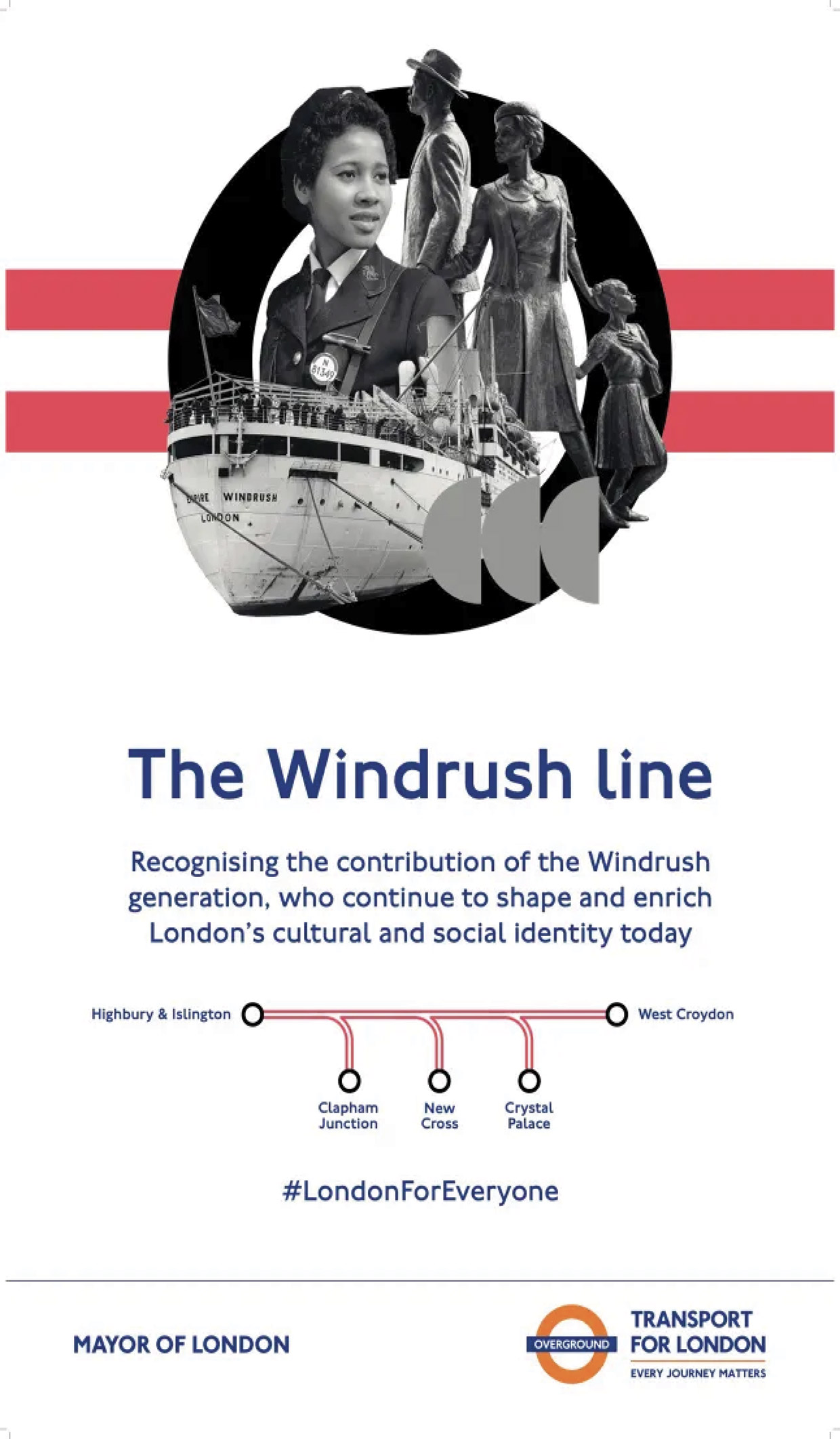
The Windrush line (red) commemorates the Windrush generation of Londoners who arrived from the West Indies from 1948.
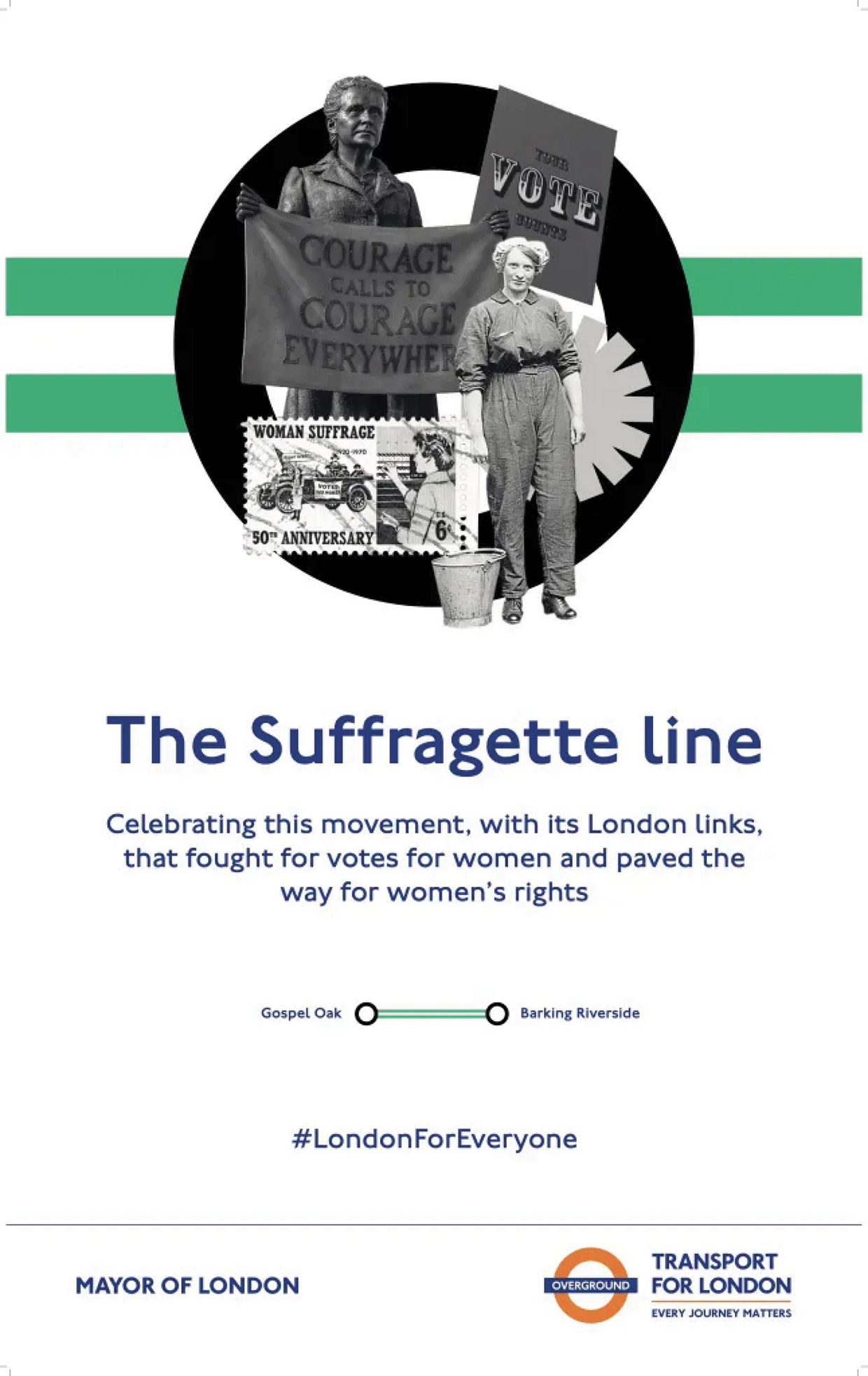
The Suffragette line (green) commemorates the involvement of many East End women in the fight for votes for women in the early 20th century.
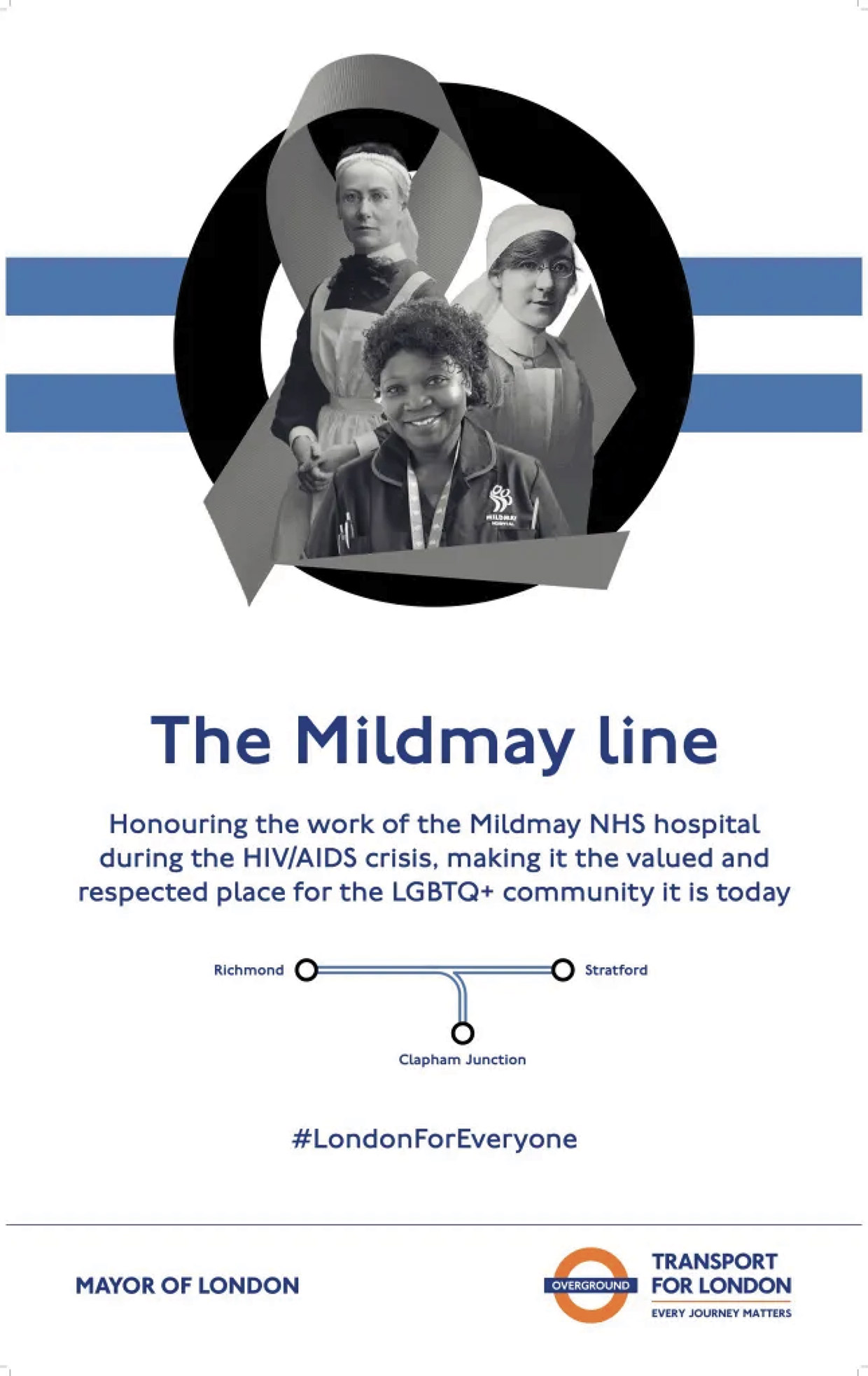
The Mildmay line (blue) is named for a small hospital in the area which has been vital in the treatment of AIDS patients since the beginning of the HIV crisis in the 1980s.
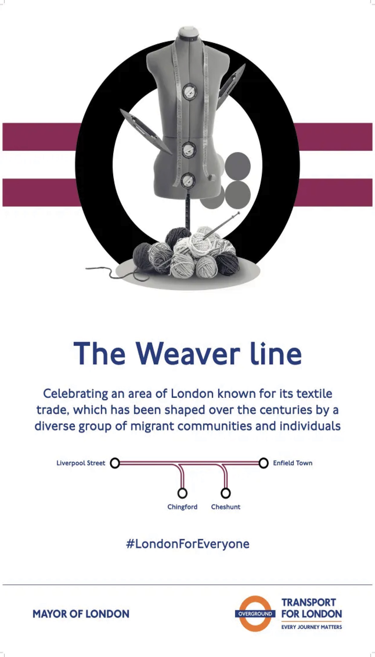
The Weaver line (maroon) runs through many areas know historically for the textile trade, which has employed waves of migrants over its history. For example, Huguenot weavers from France in the 18th century.
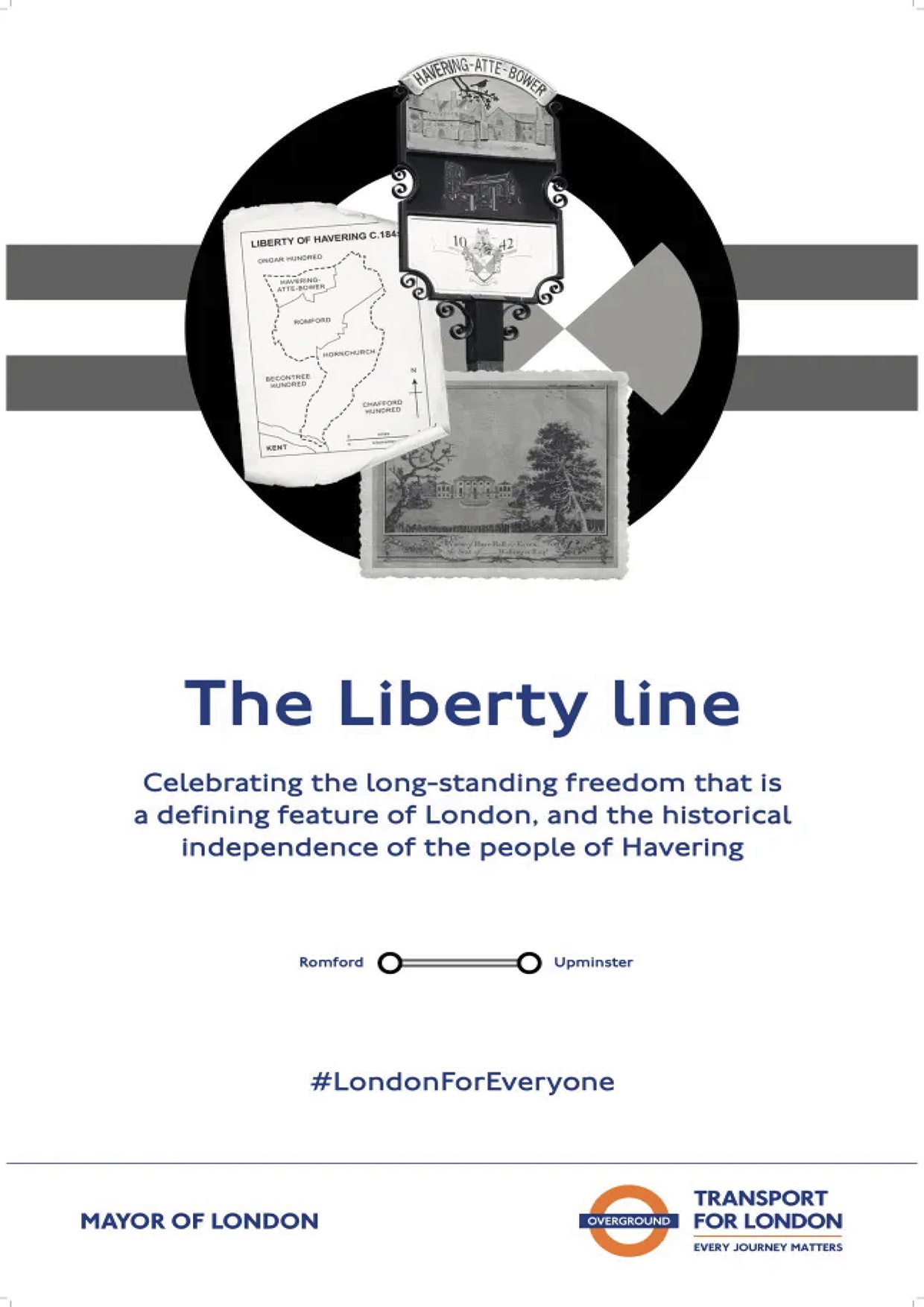
The Liberty line (grey) picks up on many references to Liberty in the Borough of Havering, which was a Royal Liberty, nominally independent from interference by the monarch, until 1888.
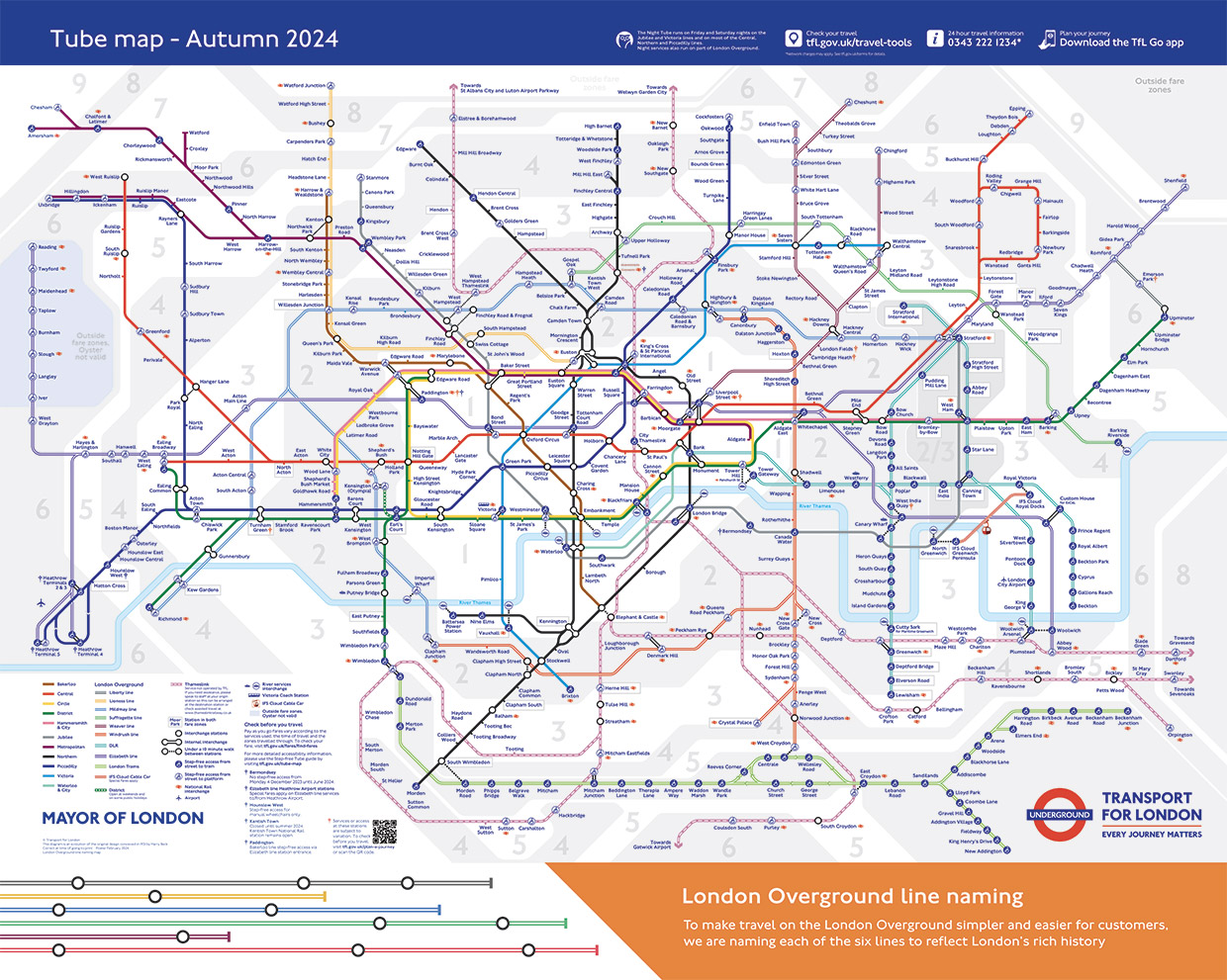
This is what the Tube map will look like with the new names. And this video explains more about how they were named.
Mapping the City
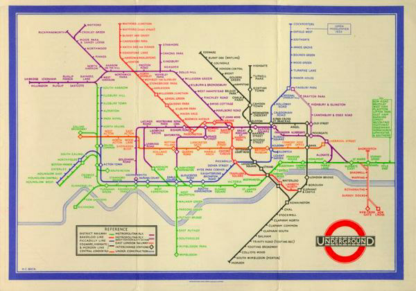
The now familiar Tube map helping passengers navigate the Underground system was considered too radical when it was proposed by draughtsman Harry Beck in 1931. Instead of a map that showed approximate distances and directions, he turned it into a diagram, with all the stations evenly spaced and all the lines going either horizontally, vertically or at 45 degrees. But when it was tested, passengers found the map clear and useful. Which is why variations of it are still used today. Learn more about Beck on the London Transport Museum site.
Copyright(s) :
TfL
> A Virtual Visit to Buckingham Palace
> Audio Resources for the Tower of London
Tag(s) : "British culture" "British history" "history" "London" "maps" "public transport" "transport" "Tube" "Underground" "videos"